
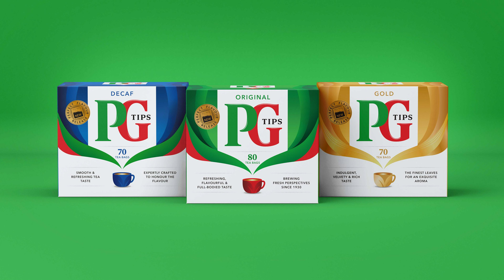
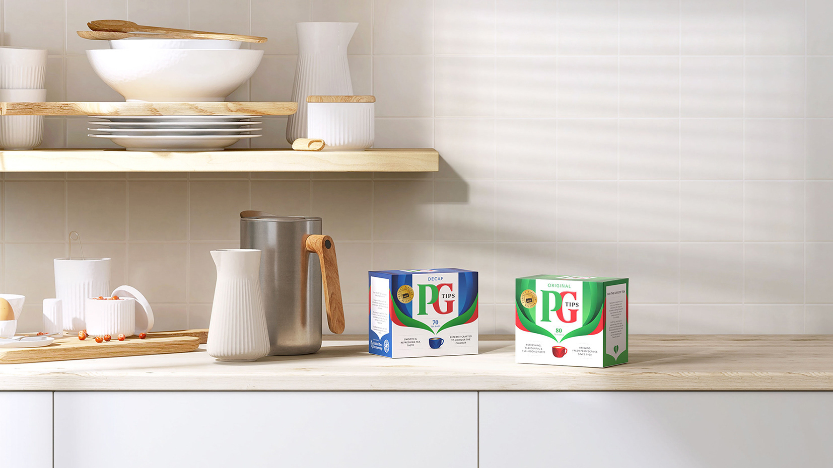
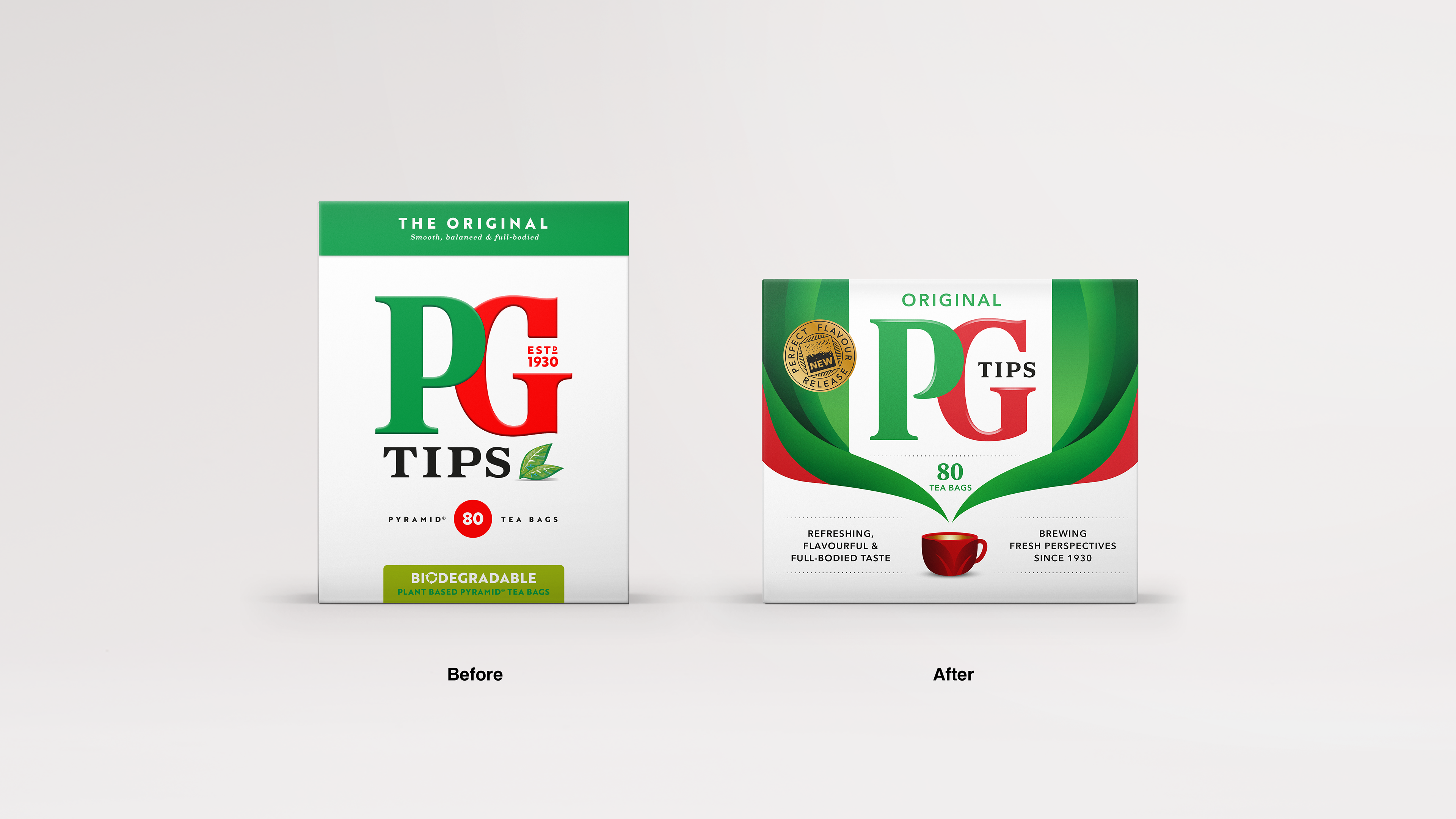
With a desire to re-ignite a stagnant tea category, PG Tips asked us to redesign their brand and packaging from a fresh perspective and a bold infusion of flavour.
A key finding from research was the emotional uplift PG Tips brings to peoples lives everyday. We captured this through the idea of 'Breaks of brightness'. Repurposing their iconic colours and giving new meaning to the use of white, we elevated the humble cup of tea, to become a significant moment in the day.
Design Agency: Pearlfisher
Role: Design Director